LABEL
Case Study @3


TOOLS USED
&DURATION
4 weeks
MY ROLE
UX/UI DESIGNE & RESEARCH
Overview
The Problem
Dropping palettes for blocks is a majority loose case for cosmetic sites and this functionality was driving more and more in with an average fall rate of 38%. People, out there were still struggling for their ideal palette which usually comes with something extra or something less but never up to their matches.
Solution
My solution was a customized palette come block app that provides users with the flexibility to create palette or block of their own preference including its (size, color, texture and amount).


"
How could we decrease the dropping rate of palettes for blocks in cosmetic sites?
"
Defining The Problem
Different people have different mindsets for cosmetics and when it comes to buying palettes then they were poles apart, but they do have a similarity which answers our most domain question, I.e, their pain points of not being able to finish their whole palette or running out of their favourite colour or their favourite colour does not come with their favourite colour which makes them to either drop the palette or buy the whole palette of no use.
Why do users choose blocks over palettes in the first place?
*adequate quantity
* fits in budget
*up to users match
Project Timeline
01
Empathize, Define
Understanding space
Defining project goal
Project Timeline
02
Research
Competitive Analysis
User Interviews
Contextual Inquiry
Survey
Persona
Task Analysis
Story Boarding
Affinity Mapping
03
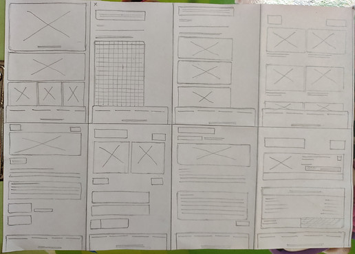
Design, Prototype
Initial design idea
User flow
Sketches
Wireframes
Feedback session
Visual Research
Final Design/hi-fi
Research
RESEARCH METHOD USED
Competitive Analysis
Secondary
Semi- Structured interviews(3)
Contextual Inquiries(2)
Survey
Primary
Competitive Analysis
I looked at palettes and block platforms that existed in the market. Limitations with these were its colour and texture, One can only select from the presets available and can not customize of their own.
Outcome: It was concluded that there is no existing service that is widely adopted among users in cosmetic (palettes/blocks) platforms, and the market is open for innovation in this space.


existing block platform
User Interviews & Contextual Inquiries
(3 User Interviews + 2 Contextual Inquiries)
Interviews included a provocation participatory activity to gather rich qualitative data. I also conducted two contextual inquiries with (palette/block) users.
Goal: To get a detailed understanding of users' dropping process, step by step, including emotional pain points and experience with current/previous palette (if had any).
Outcome: Gained valuable insight regarding users' thought processes, and learned about their major concerns that include reviews, quality, and quantity of blocks.
Relevant Findings
Colours
Users become quite choosy and creative when it comes to their eyeshadow color, they want to experiment with every possible color they can think of for themselves. Design Opportunity: Providing every possible color to users up at the front would help easify their flow.
Presets
Users were equal into exploring as they were in for customizing, Design Opportunity: providing editable presets to users for customizing as well as exploring would tackle both the needs at once.
never up to user's match!
Users share a common pain point of not being able to finish their whole palette or it usually comes with something extra or something less but never up to user's match.
Survey
Goal: To get a common understanding of users' mindset regarding blocks, their way of decision making, including their common trigger points.
Outcome: Gained quantitative insight regarding users' thought processes and learned about their real frustration behind dropping sites for their ideal palette.
Label- survey
.png)
Relevant Findings
Reviews
Users find it more appealing and trustworthy if they see good reviews about products or complaints getting solved within the app.
Dropping sites
Users drop palettes (sits/app) when they have to pay so much extra for unnecessary shadow that comes with their favourite one
Persona & Story Boarding
Outcome: Using the data from interviews, contextual inquiries, and survey, I was able to create our visual user involved in this problem and efficiently summarized its needs and goals. I used this persona when designing to ensure that my solution looped back to the needs and goals outlined in it.
.png)
Outcome: Using the persona, I also created an in-depth visual journey of users' thought processes when dropping palettes. This allowed me to uncover more findings of their emotional journey, especially on their reasons for dropping pallets.
.png)
Task Analysis
Outcome: This task analysis outlines every single task and decision a user makes throughout its way of buying pallets or dropping site. This process flow is important because by visualizing all the steps in one graphic, I was able to focus on the pain points (highlighted in blue), and can clearly identify potential areas in which i could bring changes to decrease dropping rate.
.png)
Affinity Mapping
Categorized the qualitative and quantitative data from research activities into an affinity map to make sense of the data. It amounted to ~100 post-it notes worth of data!

Design
looking for trust and security with product
GENERATED IDEAS
Design Opportunity
After forming research findings, I came up with two main features that tackled the problem space, yet still related back to the ultimate goal of promoting blocks to better.
The ideas generated came directly from research insights. These areas included addressing pain points in user's search flow, improving their satisfaction with blocks, limiting their expenses and effort. From there, I converged the ideas into separate concepts that together in one app will tackle multiple areas of the pain points discovered.
RESEARCH FINDINGS
colours
presets
ever upto user's match!
Reviews
Dropping sites
MAIN PAIN POINT
not getting what wanted
Time consuming & more effort
flexibility at customizing shadows
active review section
Userflow
.png)
Sketches
paper iteration
.png)


Feedback Session
"How am i suppose to go back?"( while on colour screen)
"Do i need to ctrl+z it?" (talking to go back from colour screen)
"Is this cancel button is not working or am I doing anything wrong?" (talking about colour screen)
takes more time on selecting colour screen
"this colour palette is easy"
"I like presets"
conclusion & reccomendation
Users confused the cancel button as the reverse button because they were unaware of the initial step of customizing- and tries to skip it and feeling stuck on the screen with no sign of reversing their actions.
Removing cancel button and providing message to inform users about initial step and further steps would tackle this problem.
more thanaverage
Time Taken
more than average
Task Difficulty
less than average
Flow efficiency
#design changes based on reccomendation
Before

After
Visual Research
Moodboard
.png)
Styleguide
.png)
.png)
.png)
Logo and Naming
.png)
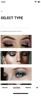
Final Design
High Fidelity screens


.png)


(a)

(b)

Summary
Choosing a problem is far more critical than solving it, a problem is nothing unless it wins the concerned race of users, and this is where the research comes in and then " Research - Research - Iterate - Design - Iterate - Iterate - Design and a never-ending process.....", I follow the same for my project, I interviewed users first while selecting the 'problem' to double ensure that Is it really a problem? Is it really need to be solved? How much do users want it to be solved? How big is this problem is?. You see, solving a major problem is a good thing but knowing that your problem wins with majority concerns yet you can add minor problems and can solve both together is a win-win case, this is something I develop while interviewing my users for this project. During interviews, I always have a list of clear thoughts regarding major concerns and minor concerns, and guess what? it works!.
At the end of the interview, I had a list of concerns which clearly states that 70% of users want blocks instead of pallets but they want it to be quick and go, they don't like experimenting where the remaining 30% of users want every colour but wanted the right to remove any block(i.e, customised). Considering their needs and wants everything seems smooth but the most challenging part was with 70% of users, where they wanted their quick and go pallets which mean they were expecting it to be of their own preference, which is quite critical because different users have different choices and designing presets up to everybody's expectation is kind of difficult. But! .., everything has a loophole and this had too, I just had to make a quick decision on What should I really be focusing on? like - Should I provide them with a colour picker option to create their own customize palette or just give them a limited colour option with an additional section of most featuring colours, demanding colours or subtle colours as presets, that peoples of similar ages and professions were using, it will give them a chance and they might give a shot to experiment.
I shuffled every possible possibility and concluded to design a solution that involves both types of users in it and this is what I did:
I designed a digital solution 'LABEL' that provides blocks and quick and go pallets (presets) to users which can be customized according to one's preference.
I included UI which is quite simple and adaptive, had most of the familiar features so users can relate to it, I tested and iterated again and again unless it meets the user's requirement who has this (70% and 30% or both or even one) need.