Aware of


Case Study @2
TOOLS USED
&DURATION
3 weeks
MY ROLE
UX/UI DESIGNE & RESEARCH
Overview
The Problem
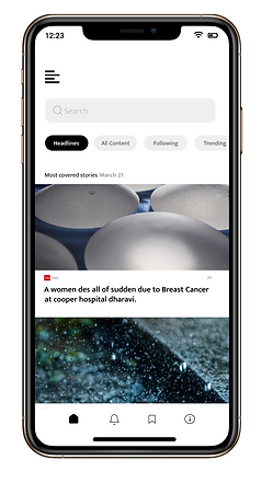
Reading news from a newspaper takes time than reading digitally as they use so many highlights which itself coveys the whole story if added together but there is no direct, why and whats of news available, users have to switch sites and go on for searching until they hit the exact answer they were looking for and in meantime, they'll be spending hours over searching which digital news platforms suppose to save for them.
Solution
My solution was news come debate app that provides users with news, and a mini assistant (can operate with voice or text) along with a basic question's presets to search for. By having all the services and information in one place this app would save users time and would increase their losing interest in news

"
How might we fulfill users' searches and decrease their dropping rate?
"
Defining The Problem
Digital news platforms have more variety than a newspaper can ever have but users still choose to switch sites whenever they doubt questions regarding the after search of news or any search that add details to news
Why do users switch multiple sites for the very same news?
*satisfying answer
* time-consuming
*to simplyfy better
Project Timeline
01
Empathize, Define
Understanding space
Defining project goal
Project Timeline
02
Research
Competitive Analysis
User Interviews
Contextual Inquiry
Survey
Persona
Task Analysis
Journey Map
Affinity Mapping
03
Design, Prototype
Initial design idea
User flow
Sketches
Wireframes
Feedback session
Visual Research
Final Design/hi-fi
RESEARCH
.png)
Journey Map
RESEARCH METHOD USED
Competitive Analysis
Secondary
Semi- Structured interviews(3)
Contextual Inquiries(3)
Survey
Primary
Competitive Analysis
I looked at online news platforms that existed in the market. They have no limitations as there is no end of the searches available, one can only read-search, read-search, and read-search.
Outcome: It was concluded that there is no existing technology that is widely adopted among users in news platforms, and the market is open for innovation in this space.


existing news platform
User Interviews & Contextual Inquiries
(3 User Interviews + 3 Contextual Inquiries)
Interviews included a provocation participatory activity to gather rich qualitative data. I also conducted three contextual inquiries with users (reading/losing) interest in news sites.
Goal: To get a detailed understanding of users' thought process, step by step, including emotional pain points and experience with digital news apps/sites.
Outcome: Gained valuable insight regarding users' thought processes, and learned about their major questionnaires which mostly include (What, Why, How, and When ) of news and their limitations to it.
Relevant Findings
Limit Readings
Existing sites use highlights which leads to extended paragraphs and then there is no end of it (includes so much data and unnecessary searches). Design Implication: Giving too many choices to users may lead to choice paralysis.
Perfect Highlight
Users fell for that perfect highlight which they consider as "short news" and spend more time on searching and simplifying. it than reading
Basic Search
Most of the primary searches done by users include ( what, why, how, and when) of news. Design opportunity: Providing primary searches as presets along with whole news would help users to get quick results.
Survey
Goal: To get a common understanding of users' mindset regarding news sites, their way of decision making, including their common trigger points.
Outcome: Gained quantitative insight regarding users' thought processes and learned about their real frustration behind switching sites for the same news.
Aware of- survey
Relevant Findings
Easy and Quick
Users find it easy to switch sites and search directly for their answers than searching in between the extended paragraphs.
Losing Interest
Users lose interest in the site/app when it comes to their time, effort, and the amount of information they were getting in it.
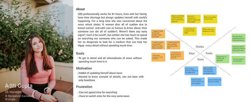
Persona & Empathy mapping
Outcome: Using the data from interviews, contextual inquiries, and survey, I was able to create our visual user involved in this problem and efficiently summarized its needs and goals. I used this persona when designing to ensure that my solution looped back to the needs and goals outlined in it.
.png)
Task Analysis
Outcome: This task analysis outlines every single task and decision a user makes throughout its way of reading news and switching sites. This process flow is important because by visualizing all the steps in one graphic, I was able to focus on the pain points (highlighted in red), and can clearly identify potential areas in which i could bring changes to decrease the switching sites rate.
.png)
Outcome: Using the task analysis, I also created an in-depth journey of users' thought processes when switching sites. This allowed me to uncover more findings of their emotional journey, especially on their reasons for switching sites.
.png)
Relevant Findings
The simple the better
Users want their answers to be straight and clear with no unnecessary details and searches.
Self Interaction
Users were tired of searching separately or within the paragraphs as they both cause them time and effort with minimal chances of getting answers.
How many searches?
As users vary, their questions vary, it can start from an 'e' and end at 'z'. Design Implication: Providing presets of every question would not be possible in this situation.
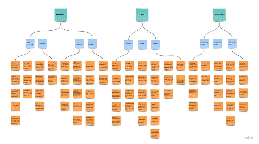
Affinity Mapping
Categorized the qualitative and quantitative data from research activities into an affinity map to make sense of the data. It amounted to ~100 post-it notes worth of data!
DESIGN
Design Opportunity
After forming research findings, I came up with three main features that tackled the problem space, yet still related back to the ultimate goal of improving news services to better.
The ideas generated came directly from research insights. These areas included addressing pain points in user's search flow, improving their process, limiting their time and concerns. From there, I converged the ideas into 3 separate concepts that together in one app will tackle multiple areas of the pain points discovered.
RESEARCH FINDINGS
Limit Readings
Perfect Highlight
Basic Search
Easy & Quick
Losing Interest
The simple the better
Self Interaction
How many searches?
MAIN PAIN POINT
complicacy and workload
lack of progress and appreciation
fear of consequence
GENERATED IDEAS
easy and direct search flow
visible status bar
Userflow
.png)
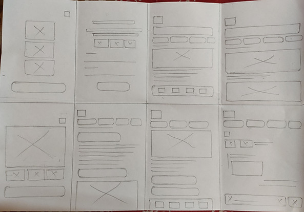
Sketches

paper iteration


.png)


.png)
Feedback Session
"Can i connect with this personn and get more detail about this incident" ( talking about public reviewer)
"How am i suppose to know more about this incident" (talking about public reviews)
"oh! i have to check reviews seperately" (talking about info page)
get frustrated at signup page
confused sign up with login page
confused between public reviews with personal one
"its good"
conclusion & reccomendation
users confuse signup page with login, so highlighting it with different colour would do the work.
providing reviews up at front and other details beneath it would tackle the review search for user.
Provide additional option to add public reviewers so users can dig up to their written incidents.
average
Time Taken
less than average
Task Difficulty
easy
Flow efficiency
#design changes based on reccomendation
Before


.png)
After
Visual Research
Moodboard

Styleguide
.png)
.png)
.png)
Logo and Naming
.png)
After forming research findings, I came up with three main features that tackled the problem space, yet still related back to the ultimate goal of improving news services to better.
Design Opportunity
The ideas generated came directly from research insights. These areas included addressing pain points in user's search flow, to improving their satisfaction, limiting their time and effort. From there, I converged the ideas into 3 separate concepts that together in one app will tackle multiple areas of the pain points discovered.
RESEARCH FINDINGS
Easy and Quick
Losing Interest
Basic Search
Self Interaction
How many searches?
Limit Readings
Perfect Highlights
the simple the better
MAIN PAIN POINT
GENERATED IDEAS
Time consuming & more effort
presets of possible questions
no limit at searches
mini assistant for unlimited searches
difficulty in simplyfying answers
Highlight keywords in paragraphs
Userflow
Sketches
paper iteration

.png)
.png)
.png)
.png)
.png)
.png)
Feedback Session
"What after clicking on presets?"
"What does mini assistant look like?"(when asked to explore mini assistant)
"oh! okay, so this is symbol is for mini assistant"
get confused while exploring
confused mini assistant with 'help & support'
abandoned while checking presets
conclusion & reccomendation
users confused mini assistant with other options so changing mini assistant's icon to something more relatable would ease this confusion.
average
Time Taken
more than average
Task Difficulty
average
Flow efficiency
#design changes based on reccomendation
Before

After
Visual Research
Moodboard
.png)
Styleguide
.png)
.png)
.png)
Logo and Naming
.png)
FINAL DESIGN
High Fidelity screens
.png)
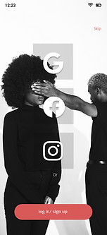.png)


.png)

.png)

.png)
Prototype

(a)

(b)
Feature &.Visual Breakdown

OUTCOME
This was a really exciting and fun project for me to work on as it provides real value, involved a ton of research, and detailed interaction work. However, shifting priorities and changing roadmaps have delayed the outcome. Still, I learned some important takeaways from this project related to the product and its processes.
How to adapt to changing requirements
New timelines, resourcing issues, and reprioritization meant the scope of the project was constantly changing. I had to adapt to those changes and still deliver the best design in time.
Always fight for good
I had to work under so many priorities that changing in every interview, but still fight for what I believe is essential to having a good user experience and interface.
Choosing what we won’t do
There were many great use cases we could tackle with a rich feature set. However, every single one was too much or unrealistic. I had to determine where the real value was for the 'Aware of' so we did not spread ourselves too thin.